Visual Storytelling: Using Images Effectively
Images break up walls of text, illustrate complex concepts, and create emotional resonance. But poorly chosen images can distract or confuse readers. Here's how to use visuals intentionally.
Feature Images Set the Tone
Your feature image is the first visual impression readers get. It appears in social shares, RSS feeds, and index pages. Choose an image that:
Relates directly to your topic (not generic "business people shaking hands")
Works at multiple sizes — it'll be cropped differently across devices
Has a clear focal point that won't be lost when scaled down
In-Content Images
Images within your content should serve a purpose. Screenshots, diagrams, and photos can clarify what words alone cannot:

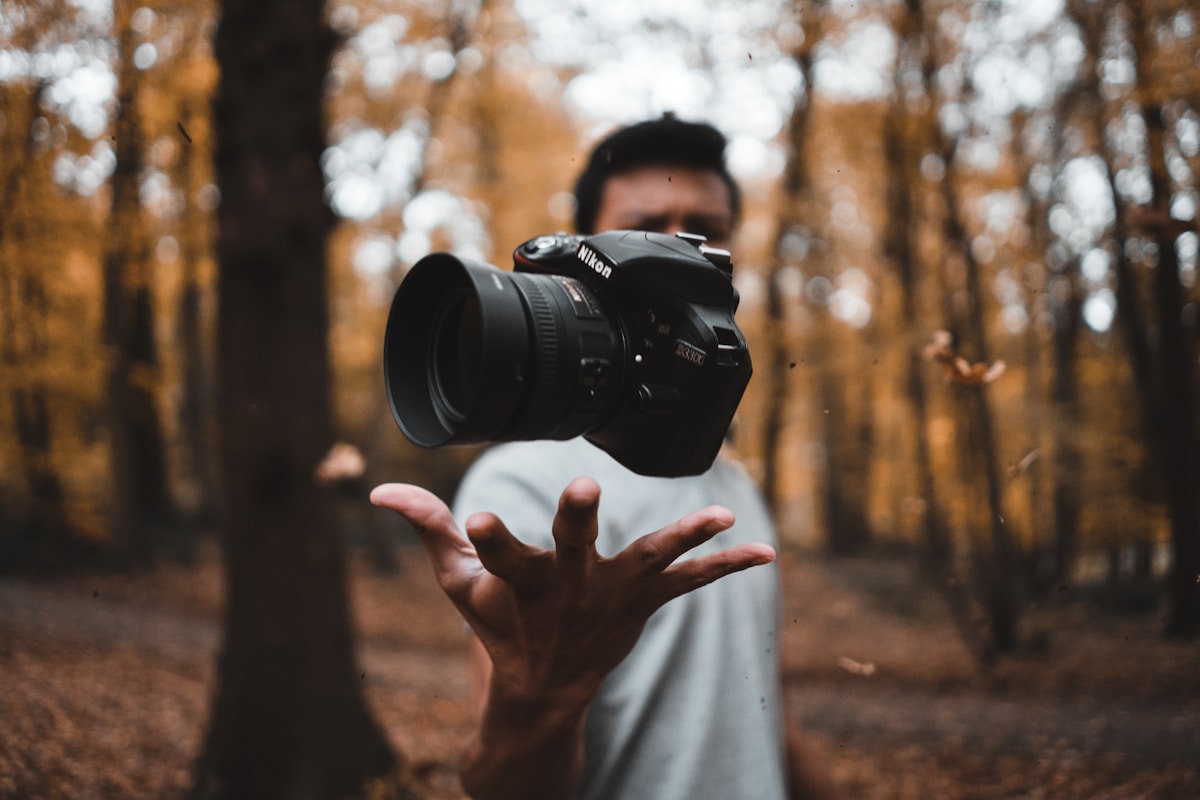
The image above illustrates a typical development environment. Notice how it's relevant to the content, high quality, and doesn't include distracting elements.
Alt Text Matters
Every image needs descriptive alt text for accessibility. Good alt text:
Describes the image content, not just "image of..."
Conveys the same information a sighted user would get
Is concise but complete — aim for one sentence
If you can't describe what the image adds to your post, you probably don't need it.
Image Alignment Options
Toast supports different image alignments. Here's an example of a centered image with a caption:

And here's a wider landscape image that demonstrates full-width presentation:

Choose your image dimensions based on the content — detailed screenshots benefit from larger sizes, while decorative images can be smaller.